Blog Post #2 and Peer Evaluation Record
Before the Revision
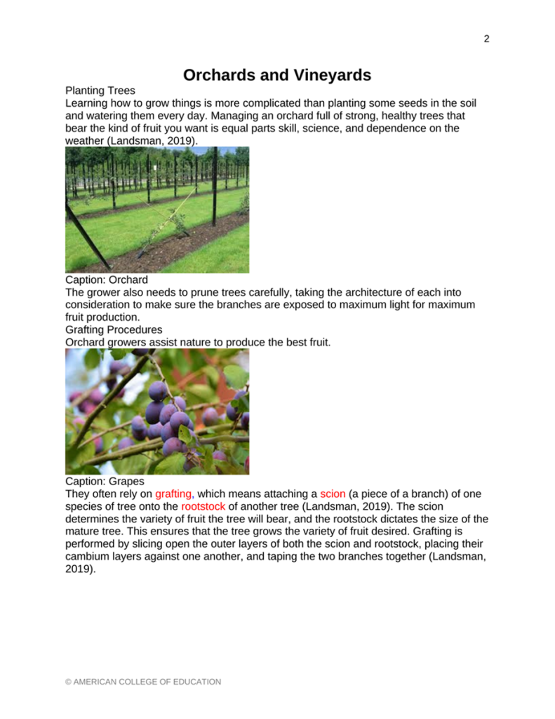
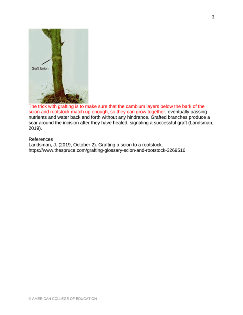
Before: Original “Orchards and Vineyards” learning object, pages 1 and 2.
After the Revision

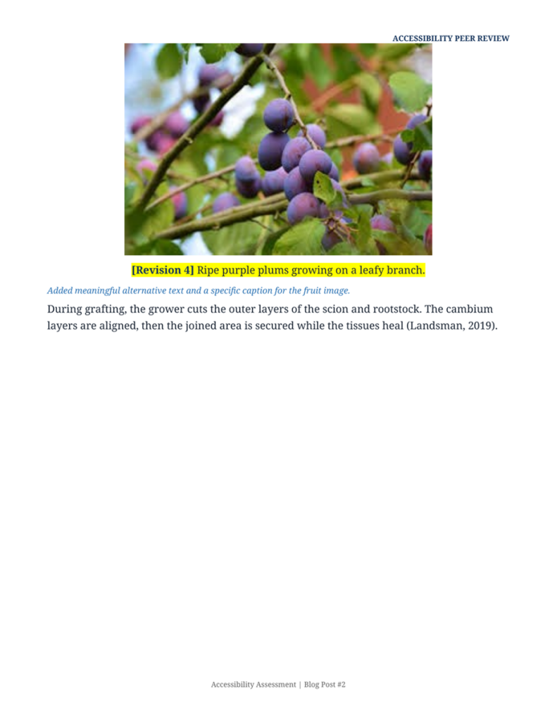
Revision Record
| Area reviewed | Barrier found | Repair made |
| Document structure | Section labels were plainly formatted. | Applied built-in heading styles and a logical order. |
| First image | The caption read, “Orchard.” | Incorporated descriptive ALT text and a caption. |
| Second image | The caption simply read “Grapes”. | Included alternative text and a caption. |
| Page transition | The second page was missing a heading. | Created a new heading “Checking a Successful Graft.” |
| Color and contrast | A significant paragraph used red text. | Converted the paragraph to dark text with high contrast. |
| Readability | There were a few sentences that were dense and crowded. | Wrote in simple terms, used shorter sentences and more space. |
Making a Learning Object Easier to Use
What I changed in “Orchards and Vineyards,” and why the changes matter
Before  | After  |
Why accessibility belongs at the start
The online learning materials influence the way students read a lesson and how they complete a task. A page may be readable on a computer screen, but not on a screen reader or keyboard. WCAG 2.2 groups accessibility into four principles of usable digital content (World Wide Web Consortium [W3C], 2023). When I was looking at the Orchards and Vineyards learning object, I applied this framework. My goal was simple. All students should arrive at the same conclusion, without having to go through a special lesson.
What worked and what created barriers
The initial object was well-focused with relevant pictures. The grafting information was also corroborated by a source. These decisions provided a helpful foundation for the lesson. There were still some features that restricted access. Labels in sections were recognized as headings, but Word did not recognize them as such. The captions of the images were not descriptive enough and provided little context. One paragraph was in red font for emphasis, creating a contrast issue. The text was also cluttered. The second page had an image in front of a new section label, and it was not clear what the reading path was.
Six changes I made
I first applied built-in heading styles to Planting Trees and Grafting Procedures. I added another heading, Checking a Successful Graft, to make the second page have a clear entry point. Then I created descriptive alternative text for all the photographs. Labels like “Caption: Grapes” were replaced with captions that explain what the image depicts. I changed the red paragraph to dark text on a white background. My last modification was to rewrite complex sentences into simple sentences, but preserving the meaning and citation.
How I checked the revision
For my review, I had two things: an automatic check and a thorough manual read. Microsoft describes the Word Accessibility Checker and the lack of alternative text and weak contrast. The checker also checks structure issues (Microsoft, n.d.). WebAIM emphasizes using headings and meaningful image descriptions. It also requires manual review due to the fact that automated testing does not cover all barriers (WebAIM, 2026). I edited and then checked the order of the headings and read each caption next to the picture. I then expanded the page and checked the spacing.
Three resources worth keeping
Word Accessibility Checker is a helpful initial check within the program. The checker checks for common mistakes and links each alert to a repair step. This is useful when writing, as feedback is provided before publication.
A more in-depth examination can be conducted using the WebAIM Word and PowerPoint Accessibility Evaluation Guide. It has a checklist that includes document structure and image access. I would use this guide prior to giving students course materials.
The screen-reader test provides immediate feedback on the learner’s experience. When reading a file with Narrator, it reveals unclear headings and repeated captions. The test also reveals an awkward reading order which a visual scan might miss.
What I learned
This review has made me rethink my editing. Accessibility should be part of the teaching and learning process, not the end of the formatting. A well-organized file will make it easier for students to find a section. Descriptions of images are clear and explain the importance of the photograph to the lesson. This work is useful for the instructional technologist to aid in the consistent practice of a school. The shared review process eliminates unnecessary obstacles and provides a useful benchmark for future materials. The size of the document selection impacts a learner’s decision to do their own work or seek assistance. This lesson will be used to inform my next design project.
References
Microsoft. (n.d.). Make your Word documents accessible to people with disabilities. Microsoft Support. https://support.microsoft.com/en-us/accessibility/word/make-your-word-documents-accessible-to-people-with-disabilities
WebAIM. (2026). Word and PowerPoint accessibility evaluation guide. https://webaim.org/resources/evaloffice/2019
World Wide Web Consortium. (2023). Web Content Accessibility Guidelines (WCAG) 2.2. https://www.w3.org/TR/WCAG22/
 Allen Castaneda
Leave a comment